


Accumulate Distribute Indicator and Accumulation Trading
The Accumulate Distribute Indicator (ADI) is a volume based tool that helps you see whether smart money is quietly buying a stock (accumulation) or quietly selling it (distribution), often before that intent shows up clearly in price. Think of it as a running tally that weighs each period’s close against its high low range, then multiplies that by volume. When ADI climbs while price consolidates, buyers may be building positions under the surface. When ADI falls while price hangs on, sellers may be unloading. In this refresh, we will break down how the line is built, how to read it on your platform, and how to combine it with confirmation tools so you stop guessing and start reading the flow of money.
ADI measures the flow of money into and out of a stock by combining where price closes within its range with the volume behind that move. Rising ADI hints at accumulation, falling ADI hints at distribution, and divergence between ADI and price is where the real edge lives. It is a confirmation tool, not a standalone signal.
| Indicator type | Volume based, cumulative |
| Inputs | High, low, close, volume |
| Best used for | Spotting accumulation, distribution, and divergence |
| Pairs well with | VWAP, RSI, support and resistance, volume |
| Timeframes | Intraday through daily and weekly |
| Weakness | Ignores gaps between sessions |
What Is the Accumulate Distribute Indicator?
The Accumulate Distribute Indicator is a cumulative line that tracks whether volume is flowing into or out of an asset over time. Developed from the work of Marc Chaikin, it answers a simple question: are buyers or sellers winning the battle beneath the surface of price?
Picture a crowded auction room. Price alone tells you the last hammer price, but it does not tell you how aggressively people are bidding or backing away. ADI listens to that pressure. When a stock closes near the top of its daily range on heavy volume, the indicator adds a large positive value. When it closes near the low on heavy volume, it subtracts.
Over many sessions those additions and subtractions stack into a single flowing line. That line is your map of money movement. If you are still learning the language of chart tools, our primer on what are technical indicators is a solid starting point before you layer ADI on top.
Accumulation: a period where buyers are steadily absorbing supply, often reflected by a rising ADI line. Distribution: a period where sellers are steadily unloading shares, often reflected by a falling ADI line.
How Does the Indicator Actually Work?
ADI works in three quick steps: it calculates where the close sits within the period’s range, multiplies that by volume, then adds the result to a running total. The math is lighter than it sounds.
Step one is the Money Flow Multiplier. You take the close, subtract the low, then subtract the high minus close, and divide the whole thing by the high minus low range. This spits out a number between negative one and positive one. A close at the high gives you +1. A close at the low gives you -1. A close dead center gives you zero.
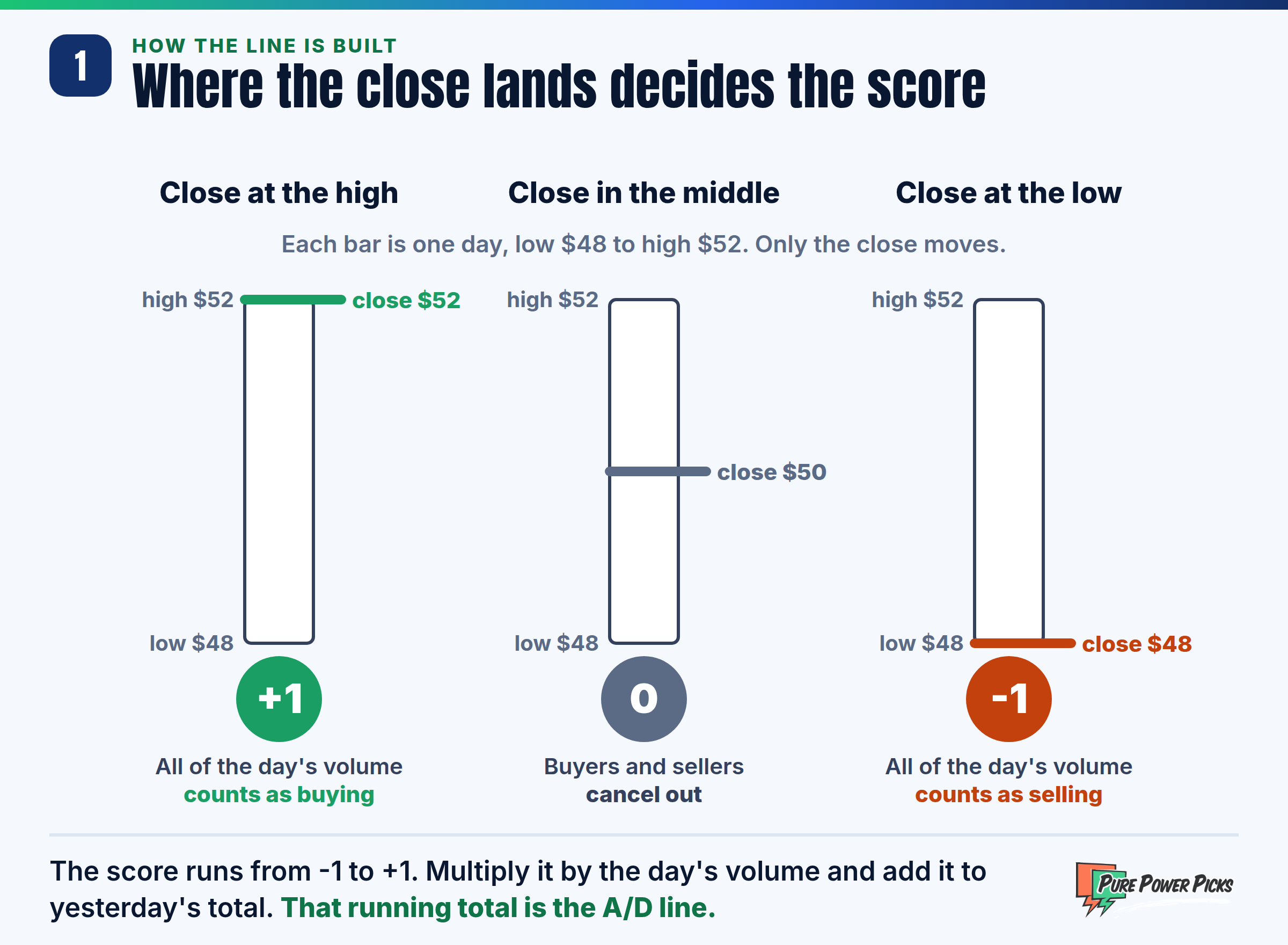
Step two is Money Flow Volume: multiply that multiplier by the period’s volume. Step three is the running total: add each period’s Money Flow Volume to the prior ADI value. That cumulative sum is the line you see on your chart. Because volume is the fuel here, it helps to be fluent in the trading volume essentials before you trust the readout.
The absolute value of ADI does not matter. What matters is the slope and direction. A stock could show ADI at 5 million or 500 million, and the number itself is meaningless. Watch whether the line is turning up, turning down, or diverging from price.
How Do You Read Accumulation vs Distribution?
You read ADI by comparing its direction to the direction of price. When both point the same way, the move is confirmed. When they split, you have a warning sign called divergence.
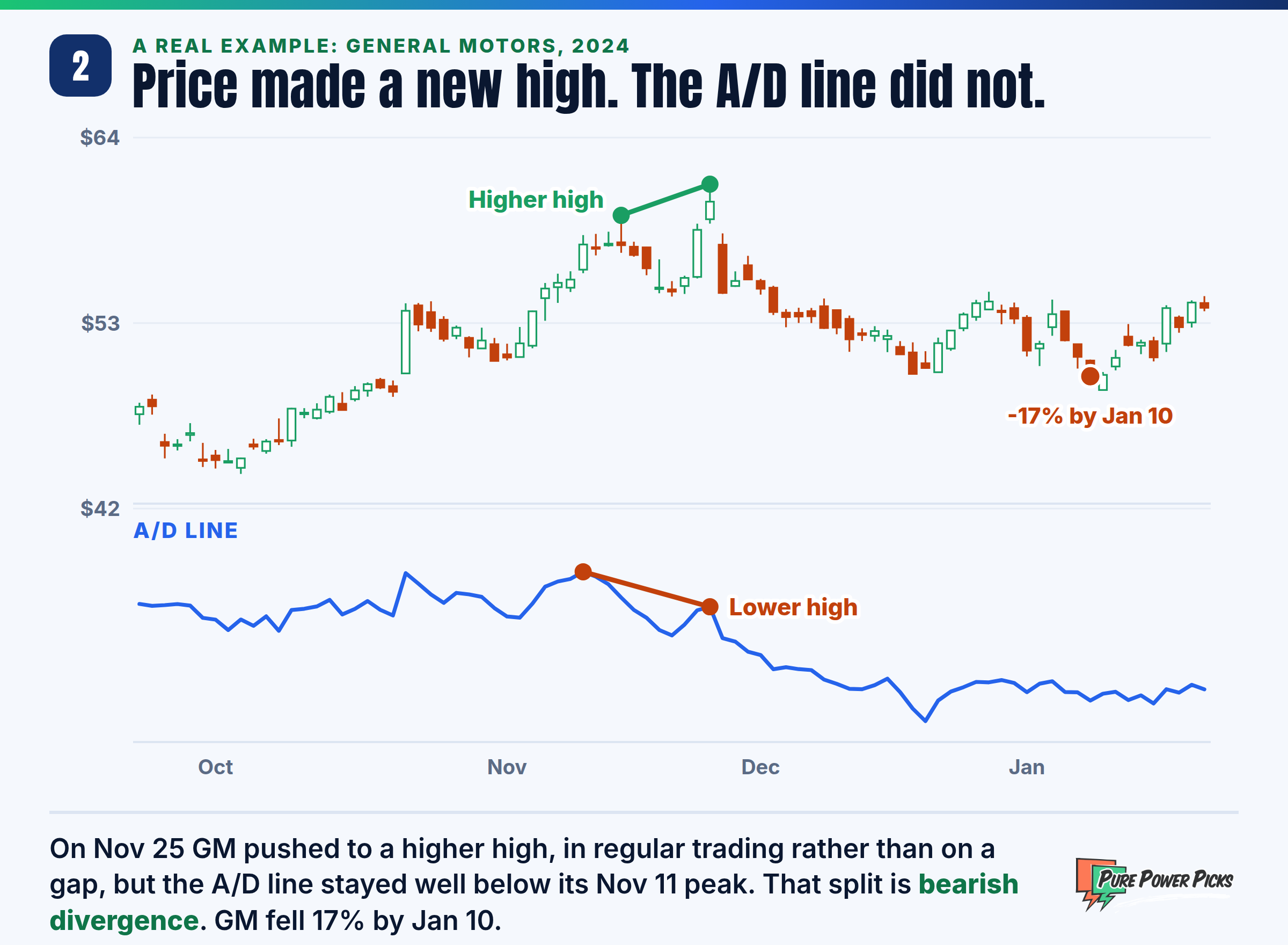
Here is the practical framework. If price is grinding higher and ADI is also climbing, buyers are supporting the trend, so continuation is more likely. If price makes a new high but ADI fails to follow, that is bearish divergence: the rally has less buying behind it than the price suggests.
General Motors in late 2024 is a real case. On November 25 the stock pushed to a higher high, and it got there in regular trading rather than on an overnight gap. The ADI line stayed well below the peak it made on November 11. GM fell 17% by January 10, 2025.
Flip it for the downside. Price making a new low while ADI holds firm or ticks up is bullish divergence, hinting that sellers are exhausted. Combining ADI divergence with the rsi indicator gives you two independent votes on the same idea, which is far stronger than either alone.
Layering ADI over your support and resistance levels sharpens the picture even more. Accumulation building right at a well tested support zone is exactly the kind of confluence that experienced chart readers hunt for.
ADI ignores overnight and weekend gaps because it only uses the current period’s high, low, and close. A stock that gaps down hard at the open can distort the reading. Never treat a single ADI signal as a reason to act. It is one input in a larger, confirmed plan.
How Do You Set Up ADI on Your Trading Platform?
Setting up ADI takes under a minute on most platforms because it needs no user inputs, just price and volume data that your chart already has.
Log in to your charting platform, pull up the asset you want to study, then open the indicators menu. Search for “Accumulation Distribution” or “ADI,” and add it. It will typically plot as a single line in a lower pane beneath your price chart. There are no length or period settings to fuss over, which is part of why it is beginner friendly.
Once it is on, stack it with tools that speak the same volume language. Pairing ADI with how to use vwap gives you an intraday map of where big money is transacting, while a quick review of charting stocks basics keeps your workspace clean instead of cluttered with a dozen conflicting lines. You can read Investopedia’s overview of the Accumulation/Distribution indicator for a second reference on the math.
How Does ADI Compare to Similar Volume Tools?
ADI is one of several volume based indicators, and knowing the differences keeps you from doubling up on tools that say the same thing.
| Tool | What It Weighs | Best Use |
|---|---|---|
| ADI | Close within range x volume | Detecting stealth accumulation |
| OBV | Whole period volume by direction | Simple trend confirmation |
| VWAP | Average price weighted by volume | Intraday fair value |
| MACD | Moving average momentum | Momentum shifts |
If you want the wider landscape, our roundup of the best trading indicators and the deep dive on popular technical indicators show where ADI fits into a complete toolkit. Momentum traders should also check how to trade the macd, since pairing a flow tool with a momentum tool covers two very different angles.
What Does an ADI Setup Look Like in Practice?
Here is a real one, taken from a past chart. It is shown to teach the pattern, not as a trade or alert.
From August 12 to September 9, 2025, Caterpillar (CAT) spent 20 sessions trading between about $405 and $438. On the price chart it went nowhere. The ADI line climbed the whole time, which means that by ADI’s math, buying pressure outweighed selling pressure across the range. That is the accumulation signal: a rising line while price stalls.
On September 16, CAT closed above $438. It got there during regular trading, not on an overnight gap, which matters because ADI only uses each day’s high, low, close and volume and does not count gaps. By October 16 it closed near $541, about 24% above the top of the range.

A chart reader would treat the flat stretch as a reason to put the stock on a watchlist, not a reason to act, then wait for confirmation: a close above the range, ideally backed by a bullish cross on RSI or a hold above VWAP. Only when price, volume, and ADI all agree would the setup earn attention. If price had closed below $405 instead, the accumulation read would have been wrong and the reader would step aside. Learning to read those confirmations is the core of understanding buy and sell signals, and pairing them with volatility context from the average true range indicator helps you size expectations sensibly.
Divergence takes time to resolve. A stock can show ADI divergence for many sessions before price finally reacts. Use it as a heads up to tighten your attention, not as a stopwatch. Confirmation from price action is what turns a hint into a plan.
Frequently Asked Questions
Is the Accumulate Distribute Indicator a leading or lagging indicator?
ADI is best treated as a coincident to slightly leading tool. Because it reacts to where price closes within each range plus volume, it can hint at accumulation before price breaks out. That said, it still relies on completed data, so treat it as confirmation rather than prediction.
What timeframe works best for ADI?
ADI adapts to any timeframe from one minute intraday charts up to weekly charts. Day traders often use it intraday alongside VWAP, while swing traders lean on daily or weekly readings to spot longer accumulation phases. Match the timeframe to your trading style.
Why does ADI sometimes disagree with price?
That disagreement is called divergence, and it is one of the most useful signals ADI provides. It means volume flow is not supporting the current price move, which can precede a reversal. Always wait for price to confirm before acting on divergence.
Can I use ADI on options?
You apply ADI to the underlying stock, not the option contract itself, since option volume is thinner and noisier. Reading accumulation on the underlying then informs how you might approach an options strategy on that name. The indicator studies the stock, your strategy is built separately.
Does ADI work in every market condition?
No single indicator works everywhere, and ADI is weakest in gap heavy, news driven stocks because it ignores overnight gaps. It shines in liquid names with steady volume where flow tells a clean story. Combine it with other tools to filter out false signals.
Learn to Read the Flow With Us
ADI is powerful, but it works best inside a full framework of education, chart setups, and community. See how our trade alert plans teach you to combine volume tools, momentum, and structure the smart way.
View Trade Alert Plans
The PPP Team is the research and editorial team behind Pure Power Picks. We trade stocks and options and publish the work as we do it, with every alert tracked in public. Publishing since 2020. How we research and correct our work is written out in our editorial standards. Our content is strictly educational, never advice.
Disclaimer: Pure Power Picks provides educational content only. We are not financial advisors, and nothing in this article is financial, investment, or trading advice. Examples are for education only. Charts of real stocks show past price history and are not trade recommendations, alerts, or results. Trading stocks and options involves substantial risk of loss and is not suitable for every investor. Past performance and hypothetical scenarios do not guarantee future results. Always do your own research and consult a licensed professional before making any financial decisions.